Custom Search
|
|
 
|
||
|
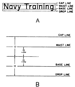
FREEHAND LETTERING As you work with experienced draftsmen, you will notice that their freehand lettering adds style and individuality to their work. They take great pride in their freehand lettering ability. By learning basic letter forms and with constant practice, you will soon be able to do a creditable job of lettering and acquire your own style and individuality. Anyone who can write can learn to letter. As you practice you will steadily improve both your style and the speed with which you can letter neatly. Dont give up if your first attempts do not produce neat lettering. Dont be afraid to ask your supervisor for a few pointers.An understanding of the letter shapes and the ability to visualize them can be accomplished by drawing them until the muscles of your hand are accustomed to the pattern of the strokes that make up the letters. You should be able to draw good letters without consciously thinking of this pattern.Your position and how you hold your pencil will greatly affect your lettering. You should sit up straight and rest your forearm on the drawing board or table. Hold the pencil between the thumb, forefinger, and second finger; the third and fourth fingers and the ball of the palm rest on the drawing sheet. Do not grip the pencil tightly. A tight grip will cramp the muscles in your fingers, causing you to lose control. If you get "writers cramp" easily, you are probably holding your pencil too tightly. The pencil should be kept sharpened to produce uniform line weights. A conical-shaped pencil point works best for most lettering. Usually, an F or H pencil is used for lettering. A pencil that is too hard may cut into the paper, or it may produce lettering that will not reproduce easily. A pencil that is too soft will require frequent sharpening, and it will produce lettering that may smear easily on a drawing.GUIDELINES Figure 3-42, view A, shows the use of light pencil lines called guidelines. Guidelines ensure consistency in the size of the letter characters. If your lettering consists of capitals, draw only the cap line and base line. If lowercase letters are included as well, draw the waist line and drop line.The waist line indicates the upper limit of the lowercase letters. The ascender is the part of the lowercase letter that extends above the body of the letter; for example, the dot portion of the
Figure 3-42.-Laying off guidelines. character i in figure 3-42, view A. All ascenders are as high as the caps.The drop line indicates the lower limit of the lowercase letters. The descender is the part of the lowercase letter that extends below the body of the letter, an example being the tail of the character g in figure 3-42, view A. The vertical distance from the drop line to the base line is the same as the vertical distance from the waist line to the cap line. It is about one third of the vertical distance between the base line and the cap line, or about one half of the vertical distance between the base line and the waist line.Figure 3-42, view B, shows an easy way to lay out guidelines for caps and lowercase. Let the height of a capital be 1 1/2 times the distance "a." Set a compass or dividers to distance "a," and lay off distance "a" above and below the midline selected for the guidelines, The method locates the cap line and the drop line. Then set the compass or dividers to one half of a," and lay off this distance above and below the midline. This method locates the waist line and the base line.To help you keep your lettering vertical, it is a good idea to construct vertical guidelines, spaced at random along the horizontal guidelines. For inclined lettering, lay off lines inclined at the angle you wish your lettering to be slanted. (See fig. 3-43, view A.) Inclined lines are known as
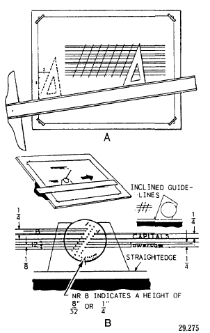
Figure 3-43.-Laying off lines for lettering. direction lines and are normally slanted at a maximum of 68 degrees. |
||
|
||