Custom Search
|
|
 
|
||
|
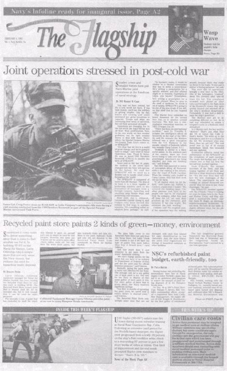
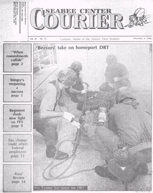
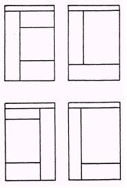
CONTEMPORARY PATTERNS While not really offering a new concept in newspaper style, the following design concepts represent a break from the pure traditional patterns: l Functional . Horizontal l Modular l Total/Single Theme l Grid In functional design, the page is made up according to no set pattern. It is based on presenting the day's news in the way that will be most appealing and convenient to the reader. The vertical line, diagonal line, circular or horizontal line could be the type of line used in fictional design. In this type of makeup, the lead story is placed in the upper left-hand corner. Functional design always lets the news dictate the layout and is characterized by very few banner headlines. It often has stories that run over the nameplate and uses short and floating nameplates, kickers, down-style headlines and several pictures. Functional design uses no decks on headlines and avoids jumps. (Headlines and headline terminology will be covered in detail in Chapter 9.) Horizontal Design In horizontal design (fig. 8-25), the page is made up by placing elements on the page so the majority of the elements present a horizontal display. In this type of makeup, the lead story is placed in the upper left-hand corner or the upper right-hand corner depending on which one you use as the final point of the page. Horizontal design provides strong horizontal units with a few vertical displays for contrast. It is characterized by large multicolumn headlines, large horizontal pictures, white space and odd-column measures. This format came about as a result of readability studies which indicate that readers estimate their reading time of horizontal copy blocks to be about half that of vertical blocks. Horizontal modules of headlines, copy, photographs and even the flag give the page a strong horizontal thrust. Modular Design In modular design (fig. 8-26), pleasing blocks (modules) of vertical and horizontal rectangles are combined. Irregular story shapes are avoided to maintain this modular look An earmark of a classic modular format is a strong vertical chimney (a panel running at least half the depth of the page) on the left or right side of the page. This chimney may contain news briefs, a complete story or only a photograph and cutline. Highly flexible and uncluttered, this design gives the editor a wide range of formats for visual impact. Total/Single Theme Design In total/single theme design, strong emphasis is placed on a single, important story or issue. Both emphasize simplicity with strong visual impact. The total page design may contain a large photograph (or line art) covering the entire area, a single story and photograph, or a billboard (dominant photograph with page reefers to major stories). The single theme page design is essentially similar, but normally does not contain stories or reefers. If you use this design strategy, make sure you stick with the theme and develop it on subsequent pages. You might have a single-page feature, two or three major stories about various aspects of the theme throughout the newspaper, a photo feature or any combination of these elements. Figure 8-27 shows an example of a total design, while figure 8-28 shows a single-theme design. Grid Design The grid design (fig. 8-29) consists of a page of modules of varying sizes with the grid lines formed by the spaces between columns and the spaces separating stories. A grid design is a pattern of intersecting lines, forming rectangles of various shapes and sizes. The objective of this concept is to take advantage of contemporary artistic principles to give a page the "now look" found in today's magazines. Lacking the flexibility of other patterns, the grid design cannot be combined with other makeups but must stand alone as a single unit. Its intersecting lines are highly structured and carefully placed to divide a newspaper page into clean-cut, simple-appearing modules whose total effect is contemporary. Stories are squared off and designed into vertical or horizontal shapes with the division of space on the page always arranged in unequal portions. The page might be divided (from left to right) into two and four columns or one and five columns, but never three and three. The top of the page is never top heavy as is the case in traditional designs. While story placement is still based on the importance of giving a particular story featured treatment, the grid design allows all other
Figure 8-25. - Horizontal design.
Figure 8-26. - Modular design.
Figure 8-27. - Total page design.
Figure 8-28. - Single-theme design.
Figure 8-29 - Grid designs stories a better chance of being seen, since they are not buried or lost to the reader. FINAL NOTE Remember that the front-page designs covered in this chapter are only suggestions for what you can do with your newspaper. A pure sample of a formal page layout is nearly impossible to find, because experienced editors are not concerned with producing textbook examples. Rather, their interest is in presenting the news of a particular day in what they believe is the best and most interesting manner. Most often that is done by combining features of several page patterns. As you gain experience as a layout editor and become familiar with established patterns, you can try out new ideas as they come to you. Trust your instincts and do not be afraid to experiment. A controversial page design is better than a dull, uninviting one. |
|
|
|
||